Designing a tablet interface for children
Designing a tablet interface for children
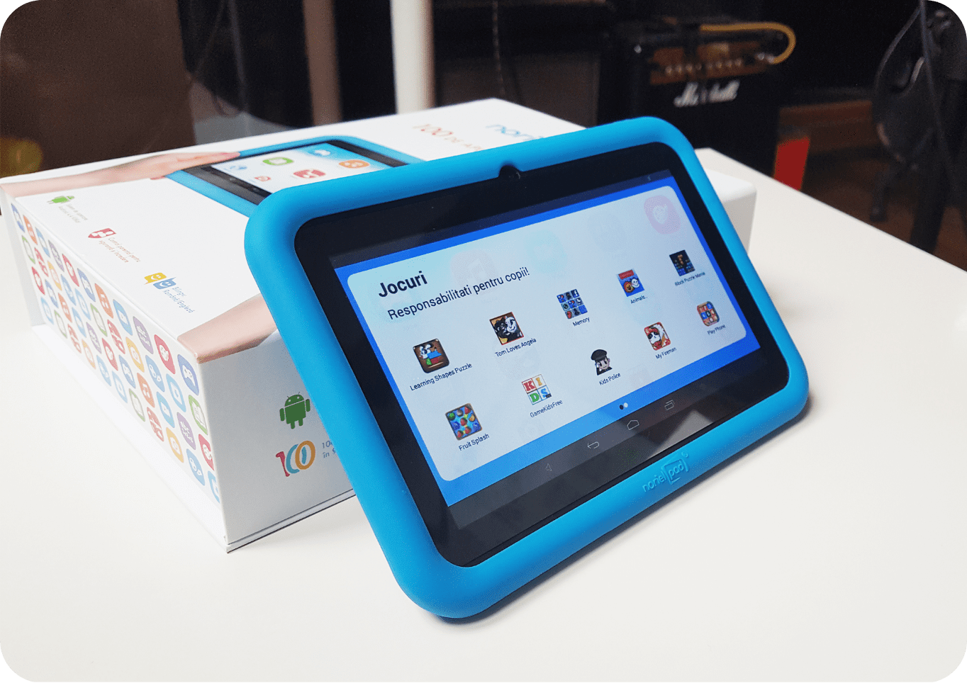
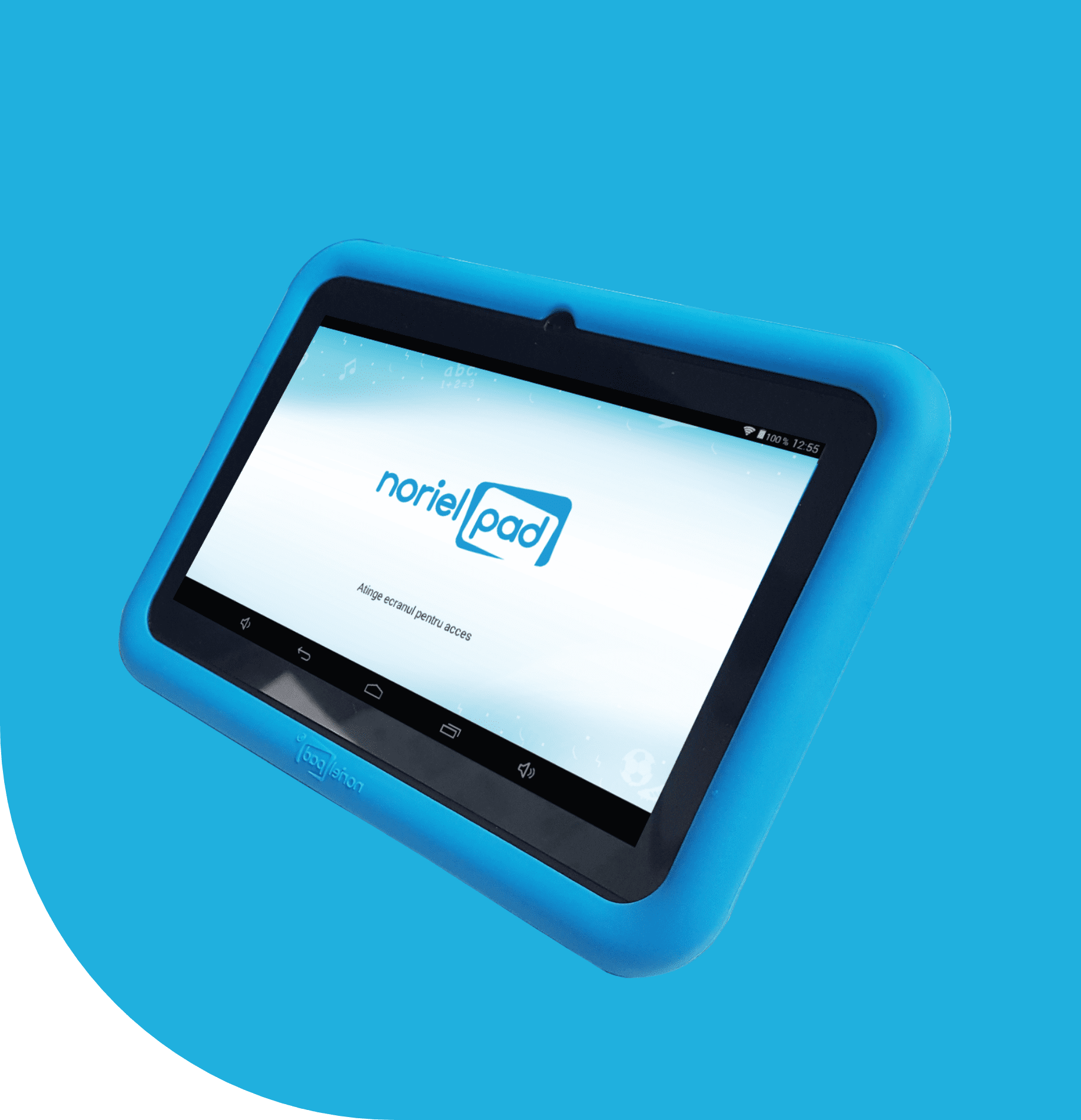
Noriel Pad is a children's tablet with custom parental controls which was launched during last year's winter Holidays (2015). So just imagine our joy when we heard that we're going to design a digital product for kids and parents.
Requirements gathering
For the process to go smooth, the Grapefruit design team and our development parteners collaborated at each stage, starting from beginning right to production. It was that important as we had to respect the deadlines agreed and match the client’s tablet suplier requirements (and timezone).
Doing so, the two teams worked and drafted the requirements together. Here was the most challeging part. Why? Well, we had to make sure that the interface was not too flashy, yet child friendly, but also parent usable, especially when working on an entry level tablet with limited specifications (although it runs on Android 4.4 KitKat).
Wireframes
During the requirements phase we drew the wireframes for each screen (the way the interface was brainstormed allowed us to tackle each state and experiment without deviating from the project’s timeline). We managed to cover all necessary aspects, from modal components to portrait-mode screens.
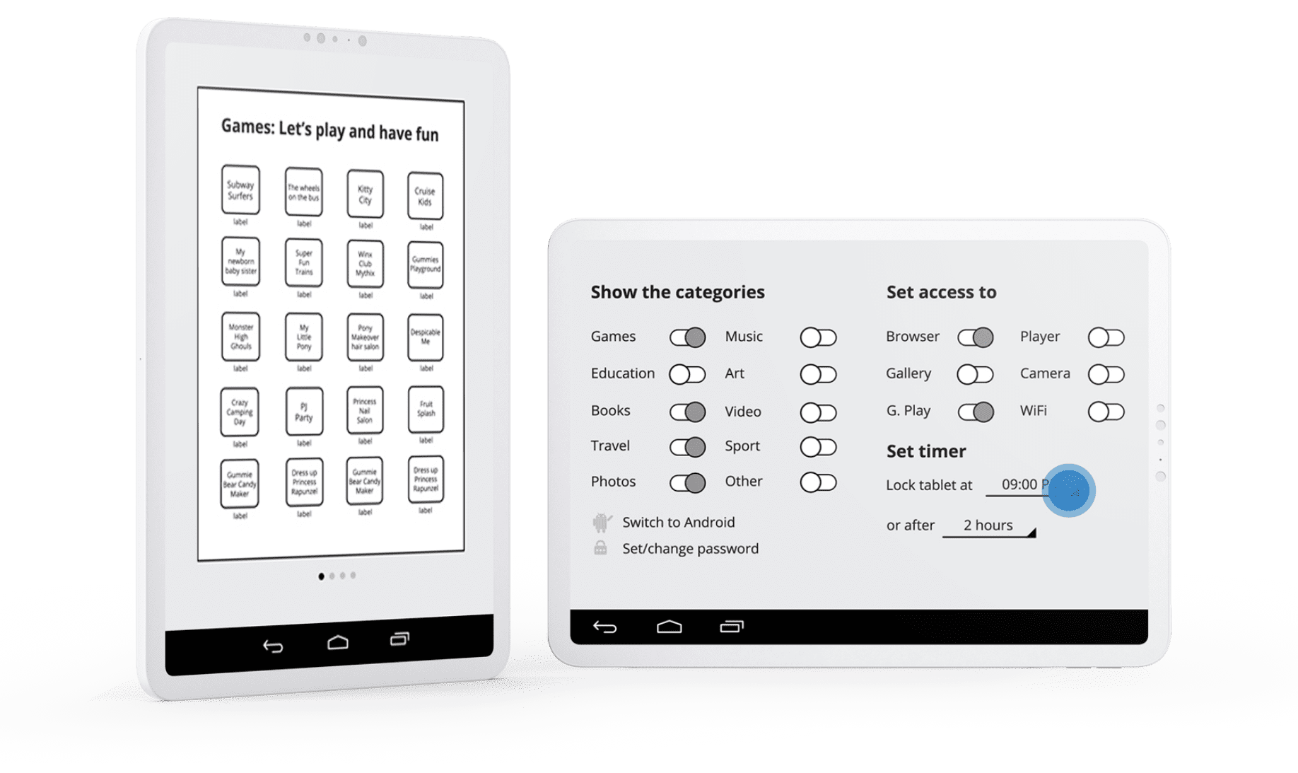
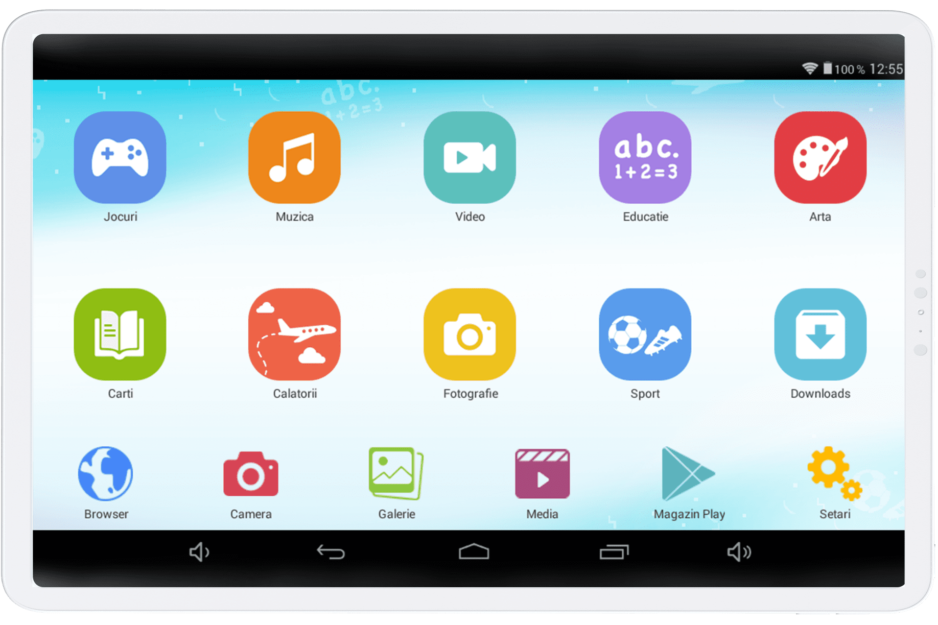
Technically there were two types of users: the children and the parents. The kids can explore groups of apps based on predefined categories (education, games, travel etc.) and access certain tablet functions (camera, WI-FI, Google Play). On the other hand the parents can connect to the parental control screen and limit the children’s activity (set new password, set timelimit, hide categories, access the default Android interface or restrict the camera or other features).
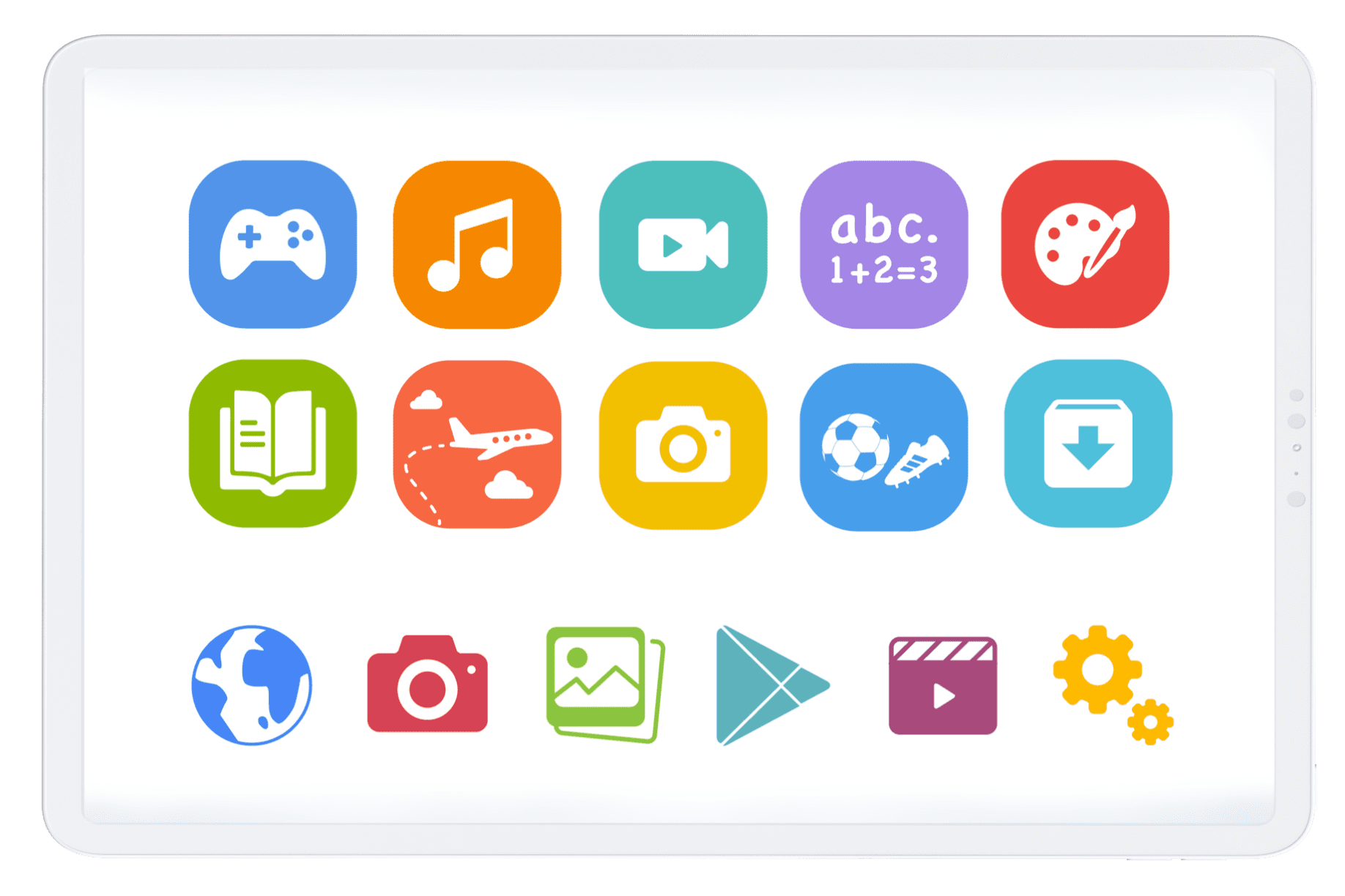
After setting the requirements, we moved to designing the visuals, starting with the center stage and its main entry points—the icons. Here, we played with gradients and shapes in order to obtain a clean and modern look that could be understand by everyone. So we thought.
User Testing
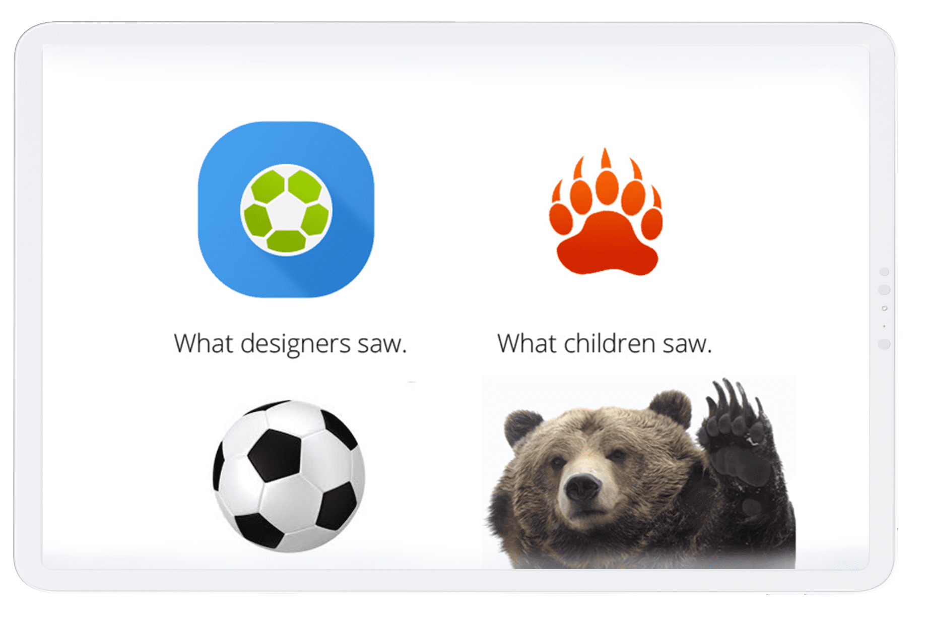
All icons looked clear enough, so we switched to an early testing session (You are not the final user remember?). We prepared the main screen with the icons we designed and we asked our mommy and aunty colleagues to test them around with their boys/girls/nieces (they matched the age criteria and profile, so why not?). How do you think it went? Surprise! Not all icons were crystal. For example for education, they didn’t know what they were looking at. Abacus? Who heard of that? A 4-year old? But the biggest WOW came from the sports category. As we all designers saw a football icon, one of the children saw… drum rolls please… a bear claw.
Conclusion
The conclusion was pretty obvious, we had to refine the icons. After iterating and re-testing them, we reached a more suitable version that enabled us to move forward with the final interface (the icons were even integrated into the final product branding). Though one thing we needed to accept: as much as we modified the icons, there was no suitable metaphor to attach to the Downloads icon for the youngsters to understand, so we trusted our guts and went with the “arrow” version.
The User Interface
Moving forward, we designed the rest of the interface. We customized the Android KitKat controls to match the overall style, but also monitored the performance of the tablet. Again, we had to be careful due to its entry level specs. (this does not include apps with high graphics that can be downloaded). For the parents we used direct-and-sincere labels, so everyone can manage the setttings/parental control screen. And we were right.
The conclusion was pretty obvious, we had to refine the icons. After iterating and re-testing them, we reached a more suitable version that enabled us to move forward with the final interface (the icons were even integrated into the final product branding). Though one thing we needed to accept: as much as we modified the icons, there was no suitable metaphor to attach to the Downloads icon for the youngsters to understand, so we trusted our guts and went with the “arrow” version.
Unboxing it
Of course we wanted to see the final product, it only seemed natural as we had lots of fun designing it. Just like a professional Youtube unboxing video we took our time and explored every inch of the tablet, box, accessories, manual… all of it. You could probably sense our enthusiasm just by reading this story.