How to file taxes without losing your soul
How to file taxes without
losing your soul
losing your soul
World Information Architecture Day set the goal for 2014 to show how Information Architecture can make life easier for end users. With D200 we showed that some things can be made more efficient as long as you really want it.

The Challenge
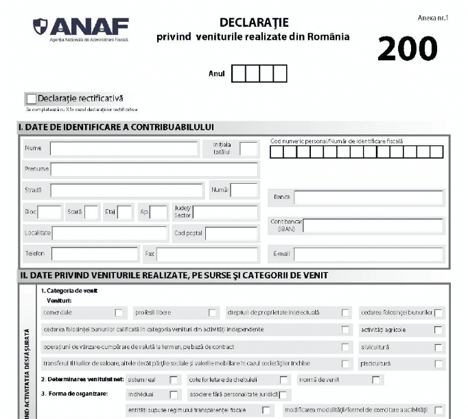
At this moment, the form is hard to follow, a format nightmare and full of explications that are difficult to understand, unless you are an expert accountant. Moreover, it doesn’t matter how many solutions we think for the user, we cannot change the legislation or procedures so we needed an approach that handles the limitations.
Technically, we want to offer the possibility to complete the form using smart and concise explications, but on the same time – generate the form using the required format ready to be signed and delivered.
This is what we want, but what
about the users?
We identified several issues, but from our point of view. The questions still remains – do the users feel the same? Or is just our curse of knowledge? Without hesitation we went on a research mission. We talked with inspectors, accountants and other experienced professionals. We launched an online questionnaire to see if we can gather even more valuable information. As expected from a rigid system we received no encouragement from the local officials. They showed us the door or refused to add any other comments (we looked like a bunch of scouts selling butterscotch cookies).
Despite these slight speed-bumps we managed to gather a sufficient amount of quantitative and qualitative data summarized in three simple conclusions:
lack of of clear and contextual explications (specific to each field to be completed)
a document format that hardens the reading process
the most difficult sections to fill are “calculating the net income” and “redirecting the 2% from the tax”
Ready to rumble
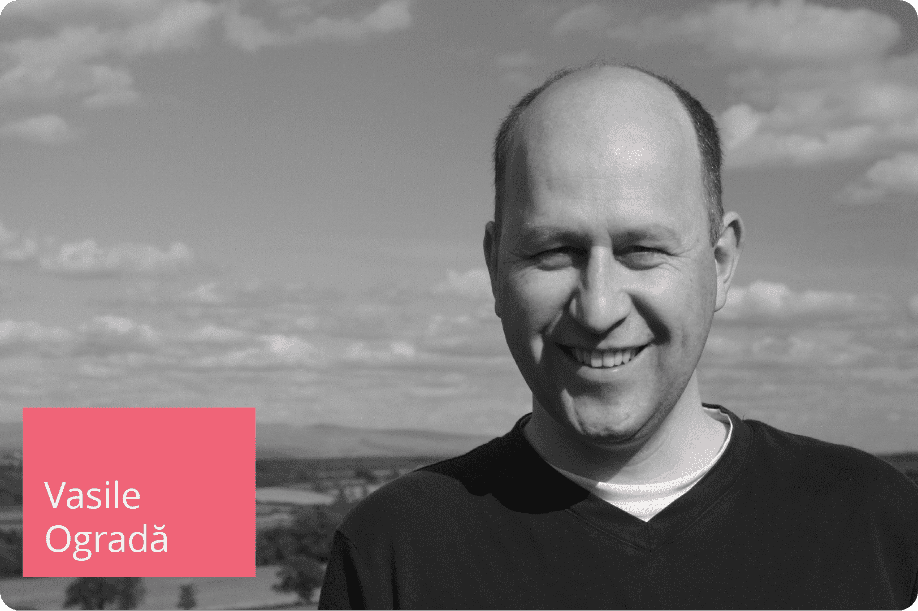
Based on the data we gathered around and through sessions of brainstorming we generated ideas after ideas: it didn’t matter if they were good or bad, our focus was to check each possible angle. For those ideas to work we defined two personas to validate them with. Meet Vasile Ogradă and Sânziana Dumitrescu.
Vasile Ogradă
Vasile is 39 years old, he is married and father of two children. He lives in Braila, finished Bucharest Agriculture Highschool and he is his own boss (has over 1250 acres of land). He is a hard working man with a lot of patience and seriousness. He drives a Dacia Duster and uses a Nokia N72. To make his business roll he needs exact and precise deadlines when he has to declare/fill in a form, deadlines and responsabilites he can find without waiting or making phone calls.
Sânziana Dumitrescu
Sânziana is 27 and she is single. She lives in Cluj (rent) and works as a web designer freelancer. She graduated Arts and Design University. She works by her own schedule and spends her free time with friends. Recently she bought the latest Pegas bicycle model. She wishes she can manage by herself all financial aspects of her freelance business, but she finds hard to find all the necessary information she needs.

Streamlining user journeys
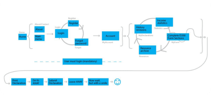
Having these personas in mind we passed them through a series of customer journey maps: to summarize – users visit the website, create an account, access the form, complete all the sections, generate the pdf file, sign it, go to the counter office, leave it there and walk happily ever after. Initially, we started with the idea of having your own account, but for the current version, it isn’t worth it. For extra functionalities like statistics or form history an account might be a required solution, but not for now.
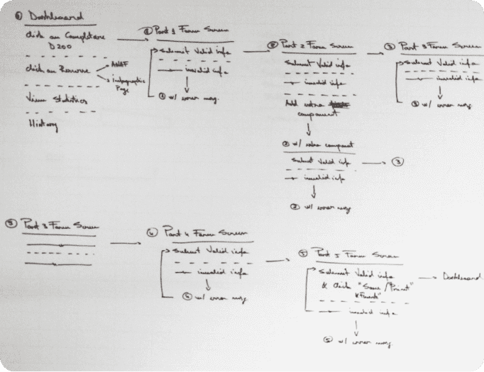
Mapping user flows
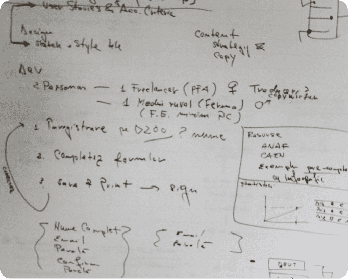
Moving forward, based on the journeys, we created the user flows matching each user’s action. It’s our way of assuring ourselves we don’t omit something. For the user flows we used the Signal-V-Noise format.
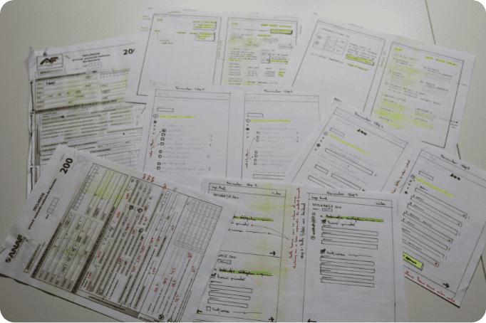
From sketch to core
Having things covered we sketched the main screens using the flows. As you can see all parts of the process are connected with each other. We sketched and sketched until we had to stop: “Yes. this is the direction we will take!”
Once the sketches were finalized we forwarded them to the development team to build the projects core functionalities. During this time the design team continued to work defining the visual style.
Styleguide
To achieve this we created style tiles to help us experiment with shapes, colors, typography without investing a large amount of time in PSD files. We chose to work collaboratively so that we can respect our planned schedule.
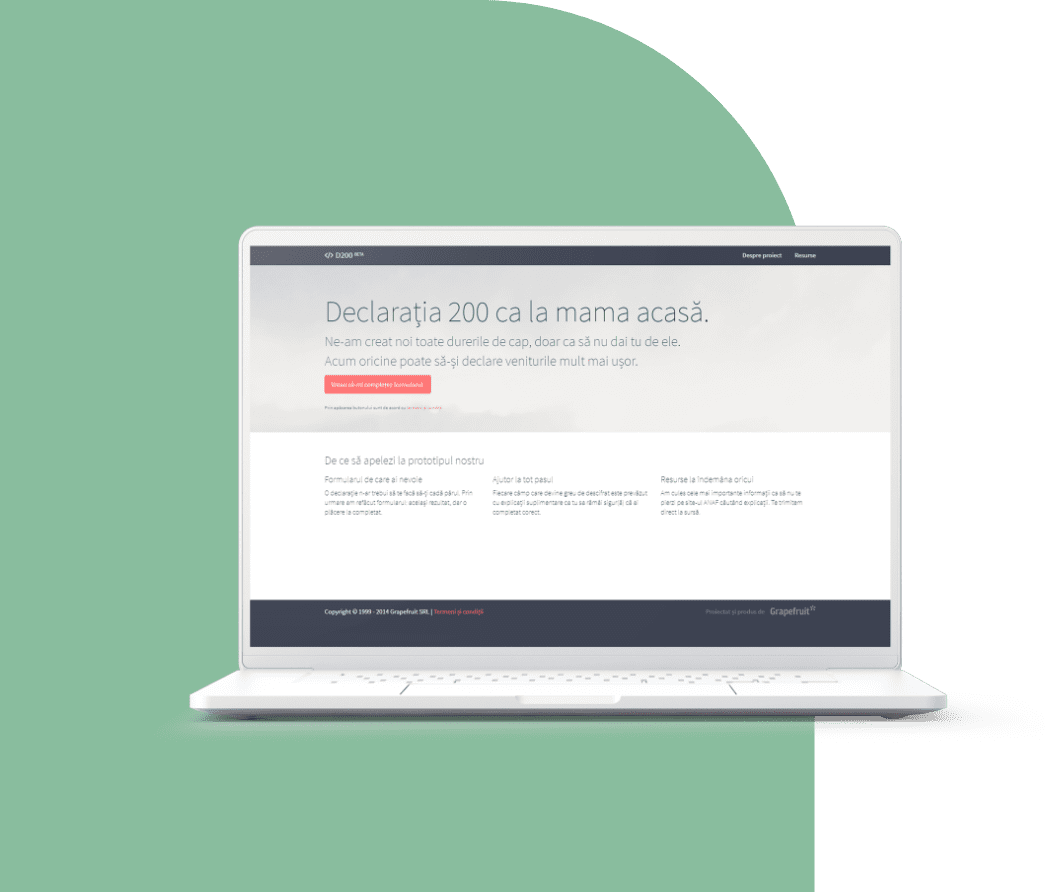
The Result
D200.grapefruit.ro has a main page (from where the user can launch the online form), an about page and a resource page full with valuable information (ToDo’s, deadlines and official ANAF links).
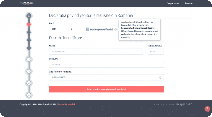
Optimizing form UX
The online form is structured in steps (accessible from the left progress bar) in order to be easy to navigate and keep everything above the fold. We tried as much as possible to reduce the scroll effect. To offer support for the users, each input placeholder offers an example to guide them. Moreover, the most difficult fields have a set of toggle activated hints. We also added subtle elements of gamification to make the form more interactive: for instance, the first hint on the form is already active so that the user can be aware of its advantage (just like a tutorial).
Dynamic form design
The form was designed to be dynamic and the user is not obligated to go through all the fields. Based on previous choices the sections change their content. For example, if you select “coin transaction operations” you will only have to fill the net gain/loss inputs – we hide the expenses fields to avoid confusion.
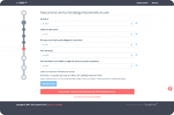
Multi-income tax aid
If you have multiple incomes, you can attach several appendixes – this helps you calculate the taxes for each additional income. The form also comes with multiple suggestions for redirecting the 2%.
Mobile, yet secure
The project was sketched to be available on mobile devices. Even so, we are talking about sensitive data (documents, official papers etc) so our recommendation is to avoid filling the forms on a phone. To keep a level of confidence, we do not save any data what so ever and you don’t need an account.
The team behind the project had three designers and two web developers working on it: Alecsandru Grigoriu, Bogdan Cernat, Ciprian Boiciuc, Dan Negrut and Eddie Vlagea.
Conclusions
With D200 we wanted to show that some things can be made more efficient as long as you really want it. Just add some sugar, spice and a bit of user experience, information architecture, content strategy and common sense.