Pharma website redesign for Antibiotice Romania
Pharma website redesign
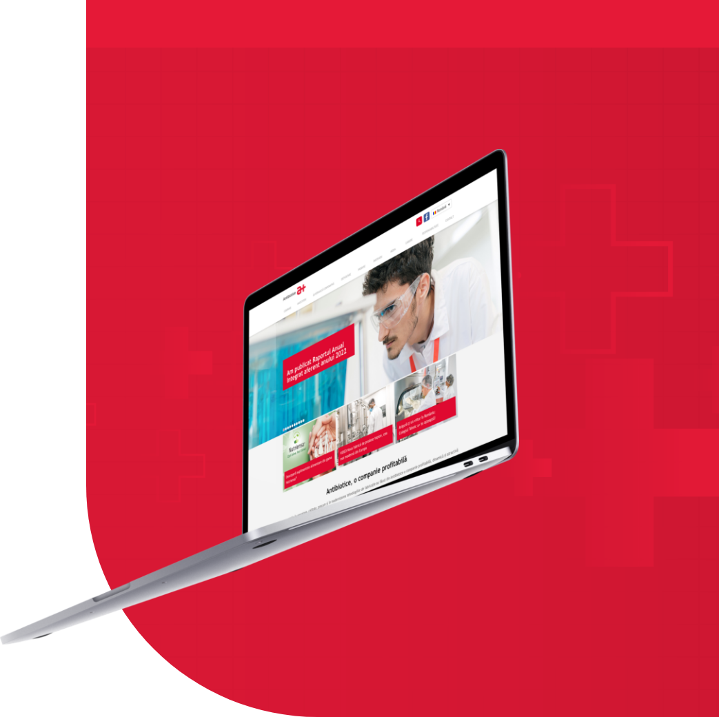
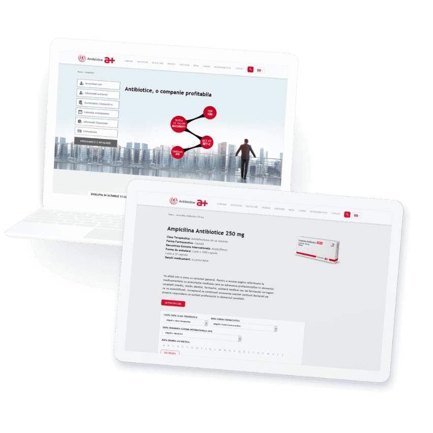
Back in 2005, we were the guys and gals behind Antibiotice’s rebranding, distinguishing itself with a modern an fresh look. Now, after a decade since the rebranding, the companies got reunited, but this time for the 2015 website redesign.
Off we go

Planning the website
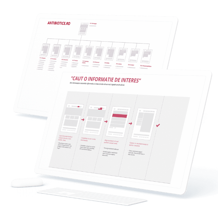
Design me like one of your french websites

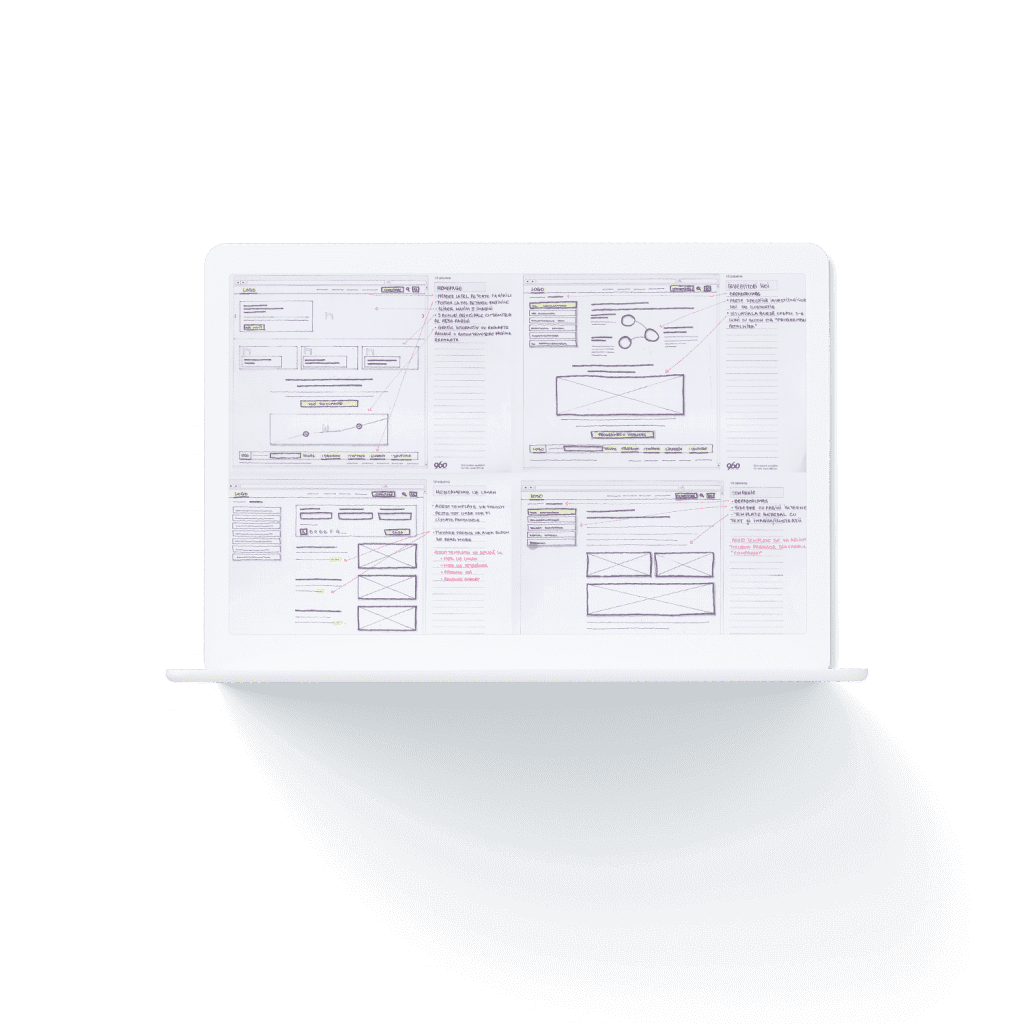
There’s no “I can’t draw”
With the flows validated, we moved to probably our favorite step in any process, and that is… sketching. We drew, we doodled, we ripped the pages like artists and then drew some more. We focused primarily on templates that match each state presented in the previous flows.
This assured us we didn’t divert from the main tracks and identify possible exceptions. Also, we didn’t invest too much time on details at this stage, leaving out content modifications/variations to be done when designing the mock-ups for each template.
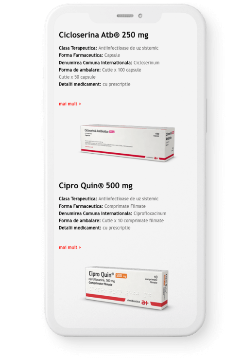
One site fits all
Clients’ team
Great feeling
