How we built an online pharmaceutical megastore
How we built an online
pharmaceutical megastore
pharmaceutical megastore
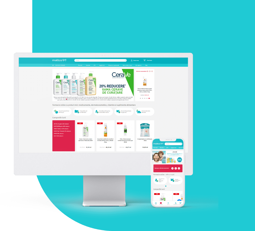
Mattca is a pharmaceutical e-commerce website that offers a very large array of categories and products. Unlike its competition, it offers the possibility to place special orders for products not available online and to buy special items created in its own laboratories.
Mattca’s objectives were clean and simple: access the local and national market, gain enough sales from its six months since it launched, enough to cover all expenses derived from the new site.
Naming and identity
Before starting to go deeper and deeper into the project, the site needed a name and a brand identity. Now that we switched our focus towards user experience and digital services, we worked with partners to develop a proper face for the online store. After several proposals and pixel tweaking, Mattca was born.
Competitive analysis
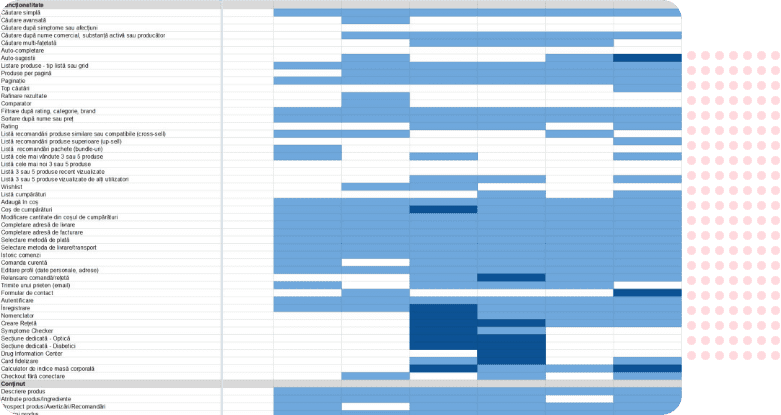
We continued with research, looking at Mattca’s future neighbours – the competition. We’ve chosen two local competitors and five international ones (going against the best). For each competitor we had a detailed list of features (a matrix full with functionalities, content, usability, branding and value criterias) and we observed where the competitors were lacking our triumphing.
Taxonomy
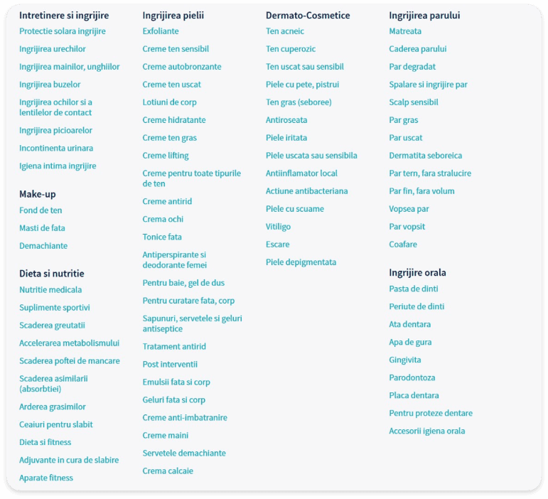
While the competitor analysis gave us valuable insight, we worked our way with the site’s taxonomy. All the products needed to be categorized and labeled accordingly so the users can get to their desired products in record time.
Personas
Regarding the users, we pretty much knew from the start and even the client confirmed who’s the main persona. Meet Laura, a 37 year old mother of two, working at a national banking firm. She has a stable income (2000 – 3000 RON/month) and her top priority is her family’s health and well being.

User stories and
acceptance criteria
acceptance criteria
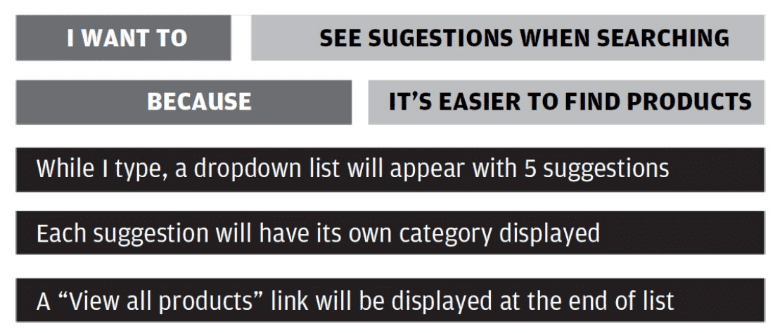
With the personas in mind, we drew the main user stories – what the customers will do on the site from start to finish. To focus more on outcome, rather than output, we gave the stories the following format: I want to (see suggestions when searching) because (it’s easier to find my products). Moreover, for each story, we added acceptance criterias to find out how are we going to validate the whole requirements. We ended up covering over 100 user stories along with more than 160 acceptance criterias.
Sitemap, sketches, wireframes
and mobile context assesment
and mobile context assesment
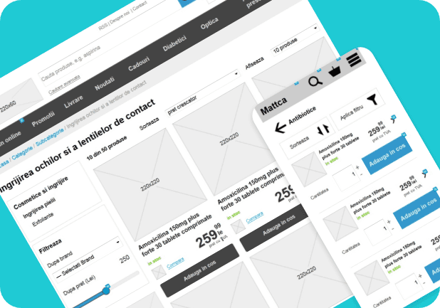
Moving forward. we designed the whole sitemap for the website and starting drawing the sketches (paper, thin liner, markers, highlighters etc). Then we switched to wireframes (in Axure) for the main pages and sections (store and account). Meanwhile, during this, we prioritized the stories we needed to keep for the responsive version of the website. Here we used, AListApart’s mobile context assesment principles from the popular Organizing Mobile article.
Visual style
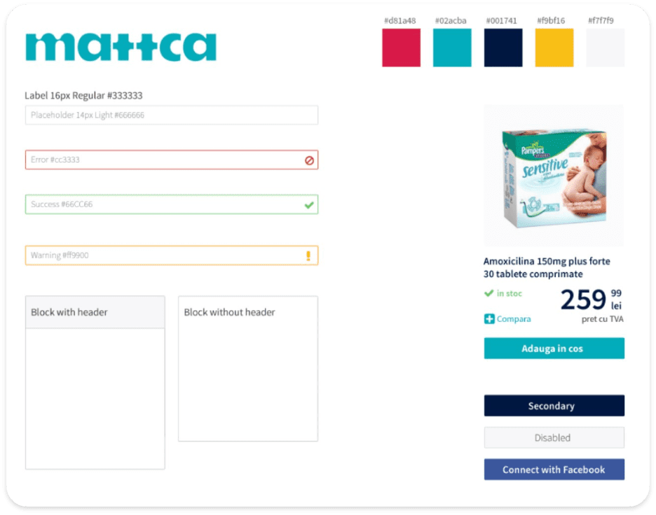
Having all in place, we drew the visual style and the main look and feel based on the created brand. We didn’t create and pages in Photoshop, we worked closely with the developers and gave them guidelines on how to apply the style over the wireframes. We need to to prototype fast and efficient.
Development
Mattca’s objectives were clean and simple: access the local and national market, gain enough sales from its six months since it launched, enough to cover all expenses derived from the new site.
Content management process
Now we have about 10.000 products in Magento, but behind this number there was a hard work and sweat and many people involved. For this project we recruited a team of 10 content editors from 100 possible candidates.
After we trained the editors we started working. That means a huge Google Drive sheet full with information. This was the ”Product List”, the chaos killer, and this list was like a little child who grew up over the time. In this huge list we have six sheets with: products status, categories, attributes, frequency, promotionals items and finally…The Sheet with all the products.
Every single product followed the same flow. The client introduced the product in the Product List (in this part of the process the client was the key driver). After the product was introduced we received the information about new brands or products. We validated the information (the descriptions and the pictures), and then we sent all the data to content editors.
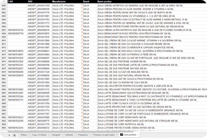
After each portfolio was uploaded we checked the products from ten to ten.
Now we have:
440
total categories
73
product attributes
10
product templates
Blog
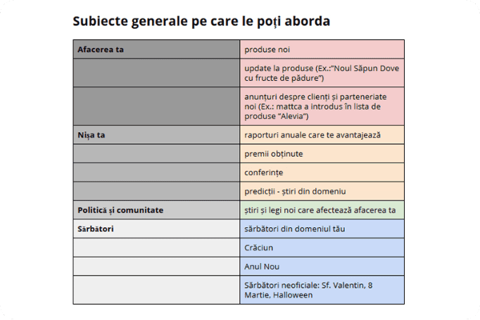
Along with content management we handled the blog, newsletter, promotions, facebook, banners and SEO.
For the blog we chose WordPress as our CMS. We wanted to create an intimate space where we can rediscover our feminine side. The voice and tone are colloquial and homelike. We developed the blog at a steady pace. First we gave it a new identity. It’s a bit different from the site, and the name that we chose for the blog is ”The health pill”.
After that our creative minds drew ”Doctor M”, a young and in good spirits doctor, our voice..
On the blog we post twice a week. The articles are planned in advance and the topics are chosen based on the customer needs and the keywords that he uses. The articles are connected with the Mattca Facebook page.

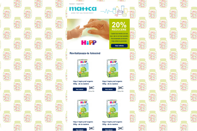
Newsletter
We created the newsletter with our core and secondary audience in mind. That’s why we designed six newsletter templates: bio, make up & cosmetics, mothers, vitamins, medical equipment and a general template.
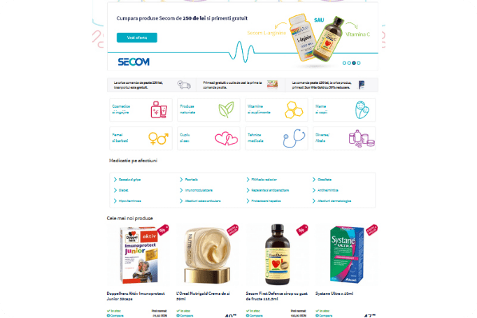
Promotions
In this case we have left Magento work its magic. We knew that we had many types of promotion available such as: 1+1 free, percentage discounts, gift on the first order on site, and others.

SEO
During the project we made several adjustments to accommodate various SEO improvements. The homepage experienced the biggest changes after the SEO report. We added a stripeline and the main categories below the homepage slider. We reconsidered the way the user browsed Mattca. This meant that we moved the main diseases, from navigation to the homepage, because a great number of clients used disease related keywords to find various products.
Content strategy
The master of puppets was content strategy. All that elements of content management were led by content strategy principles. In this process we made it to the end because we knew from the beginning that the main purpose of content strategy was to align the business goals with customer needs. The main challenge was to align the different communication channels: the actual site with blog, newsletter and Facebook. For this we did a guide for every channel. The audience was the same, but the voice and tone were not. At this stage we did editorial guide (a general one and several particular guides).
We handled the microcopy, banners, transactional emails, titles and so on.